
nov, 2017
Firefox Preferences
UX
Research
Product Management

Mozilla Firefox is one of Mozilla’s successful products that empowers users’ web browsing experience with the focus on privacy and security. However, the successful product isn’t that successful in countries outside of North America and Europe.
Therefore, starting from the beginning of 2018, the team was asked to explore more opportunities in Asia by building new, sustainable products that support Mozilla’s mission.
As we saw the rising online usage of Taiwanese seniors, we assumed that there were some opportunities in Taiwan that we could experiment with.
There was no clear direction defined when starting the project, so the team had the full flexibility to define the project schedule, research methods, and how to generate and validate the idea.
The only 3 requirements that the product concept needed to meet were:
1. Align with Mozilla’s mission
2. Ability to experiment with business models
3. Have stakeholders agree
The team consisted of 4 members participating
in the entire design process.


PROJECT LEADER
Define the project roadmap, set goal and metrics, host internal presentations & communication, and pitch to VPs.
USER RESEARCH
Recruit participants, support user interviews & synthesis, design surveys, and analyze survey data.
WORKSHOP FACILITATOR
Run brainstorming workshops like design sprint, participatory, and product naming.
UX DESIGN
Design app wireframes and make interactive prototypes.
PUBLIC RELATIONS
Write blogs, internal newsletters, and pitch the product concept to external audiences.
Taiwanese seniors
aged between 55~65

ONLINE EXPERIENCE
How do seniors get information online? What actions do they usually take to get jobs done? Any frustrations?
UNMET NEEDS
What are seniors’ values and unmet needs? What do they expect in their future?
DEVICE MINDSET
How many mobile devices do they have? Do they use multiple devices at the same time to get a job done? Why?
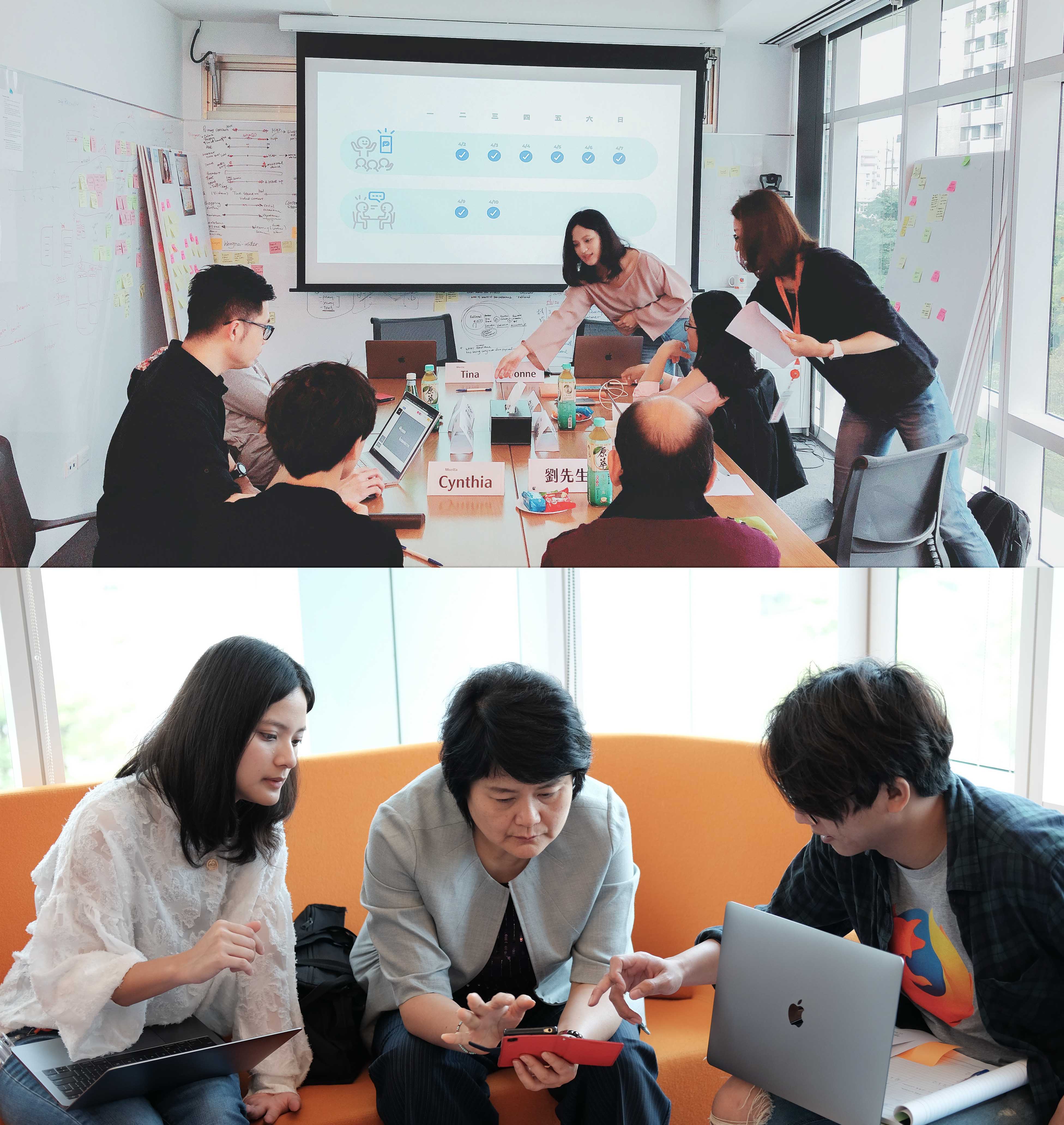
We conducted 4 rounds of user interviews with 34 participants from street intercepts to in-depth interviews.
The design direction and research target pivoted based on each round of research results.

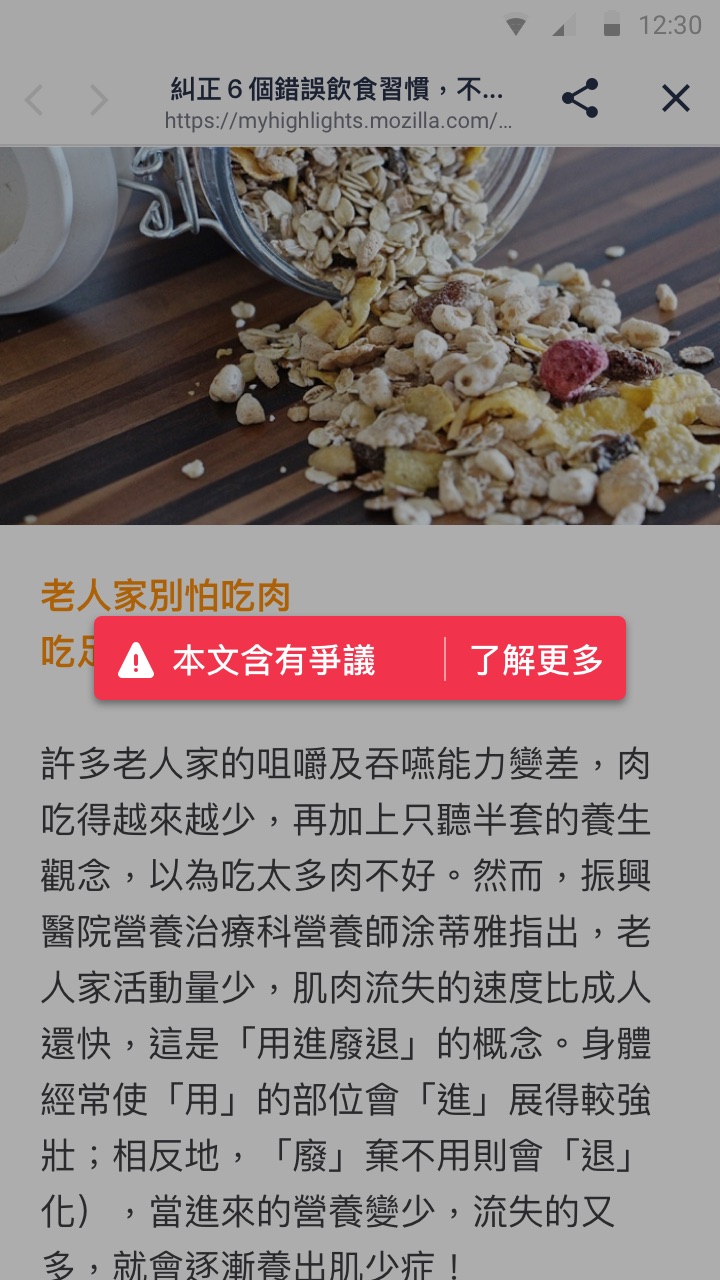
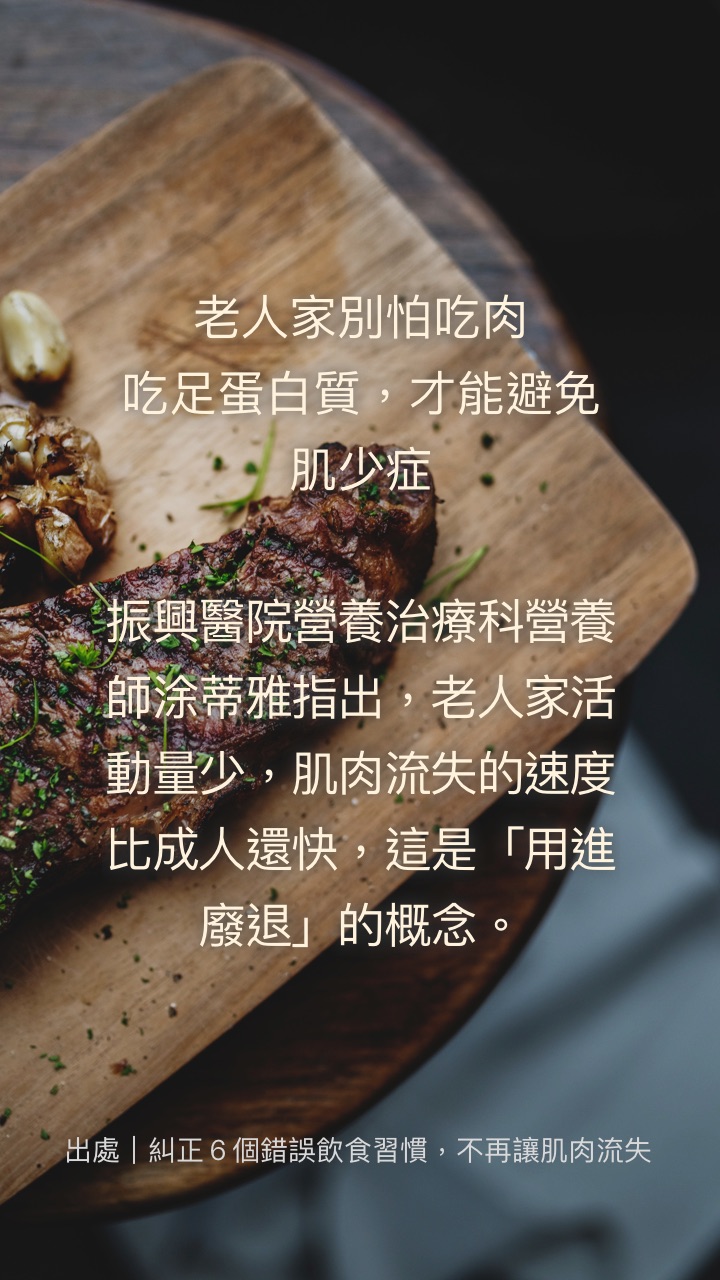
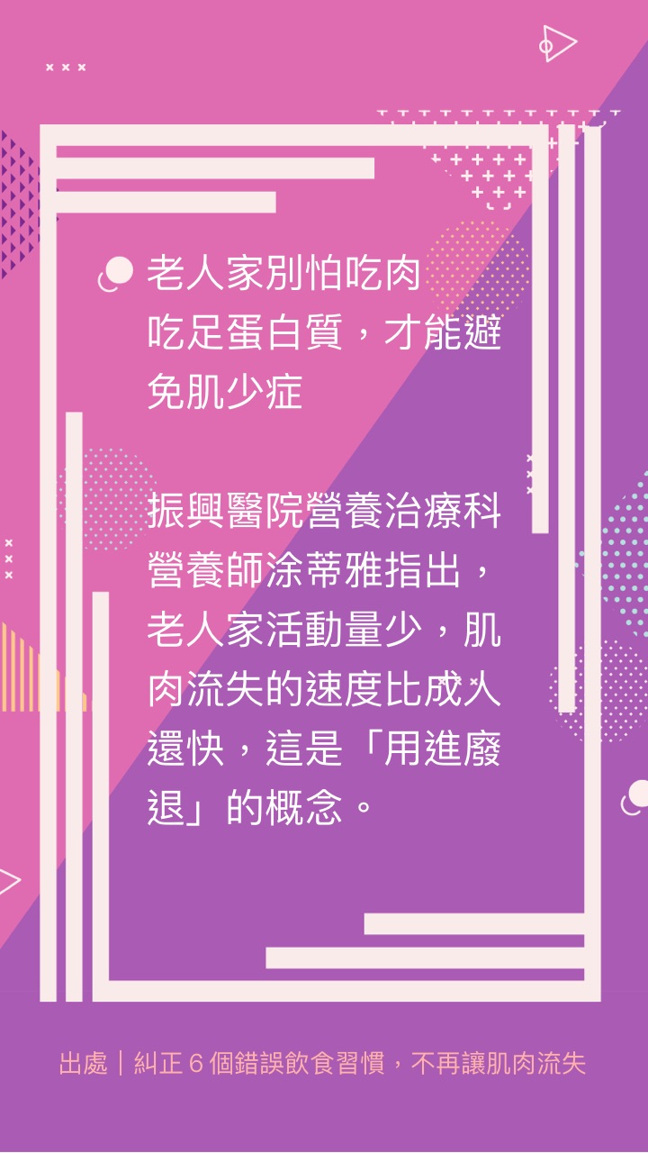
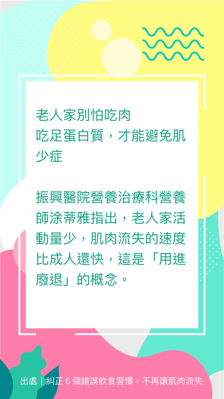
Collecting and Sharing articles about health info, interesting stories, or today’s news on chat apps is essential to seniors’ daily lives. It’s a way for them to stay connected with their friends and family, and gain recognition at the same time.
We noticed a large number of seniors who use multiple devices (smartphone, tablet, and desktop) at the same time to accomplish a task.
The common reason behinds that is the decline in their eyesight and screen-typing ability. Therefore, a product with high readability and some typing support can be a huge advantage for this generation.
Friends and families on chat apps are a major source of information for seniors. However, their loved ones shared a lot of misinformation that requires further validations before forwarding.
Inadvertently sharing misinformation will get negative feedback which might embarrass them and stop them from sharing.

It’s the opportunity we observed from our participants. Therefore we defined the ideation scope by focusing on seniors’ user journey from collecting, reading, to sharing information online.
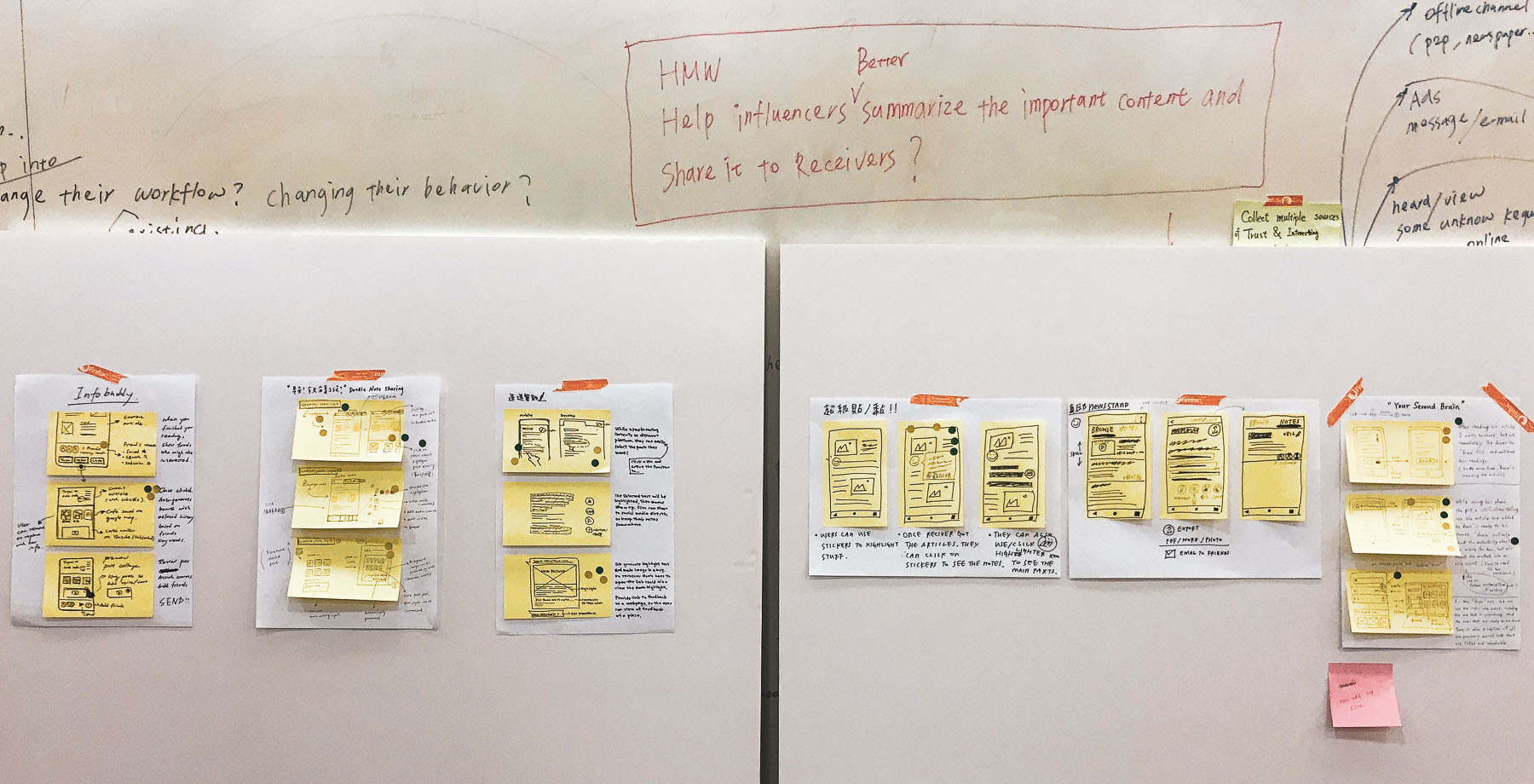
The design sprint
workshop
The reason why we chose design sprint as the core method to generate ideas was because it’s a very nice tool to quickly get input from different perspectives (e.g. business, engineering, and marketing) and have cross-functional teams agree on the same direction. With the mixing of Lean UX, we can have an evaluation of risk and value before actually digging in.
However, blocking stakeholders’ time for 5 days was impossible for us. Therefore, reaching a consensus on a direction was the first priority of the workshop. I redesigned the workshop that only included activities from the first 3 days of Design Sprint. The design challenge was predefined based on the research results, as that can help the stakeholders to have a clear scope in mind at the beginning and make the use of time more efficient.

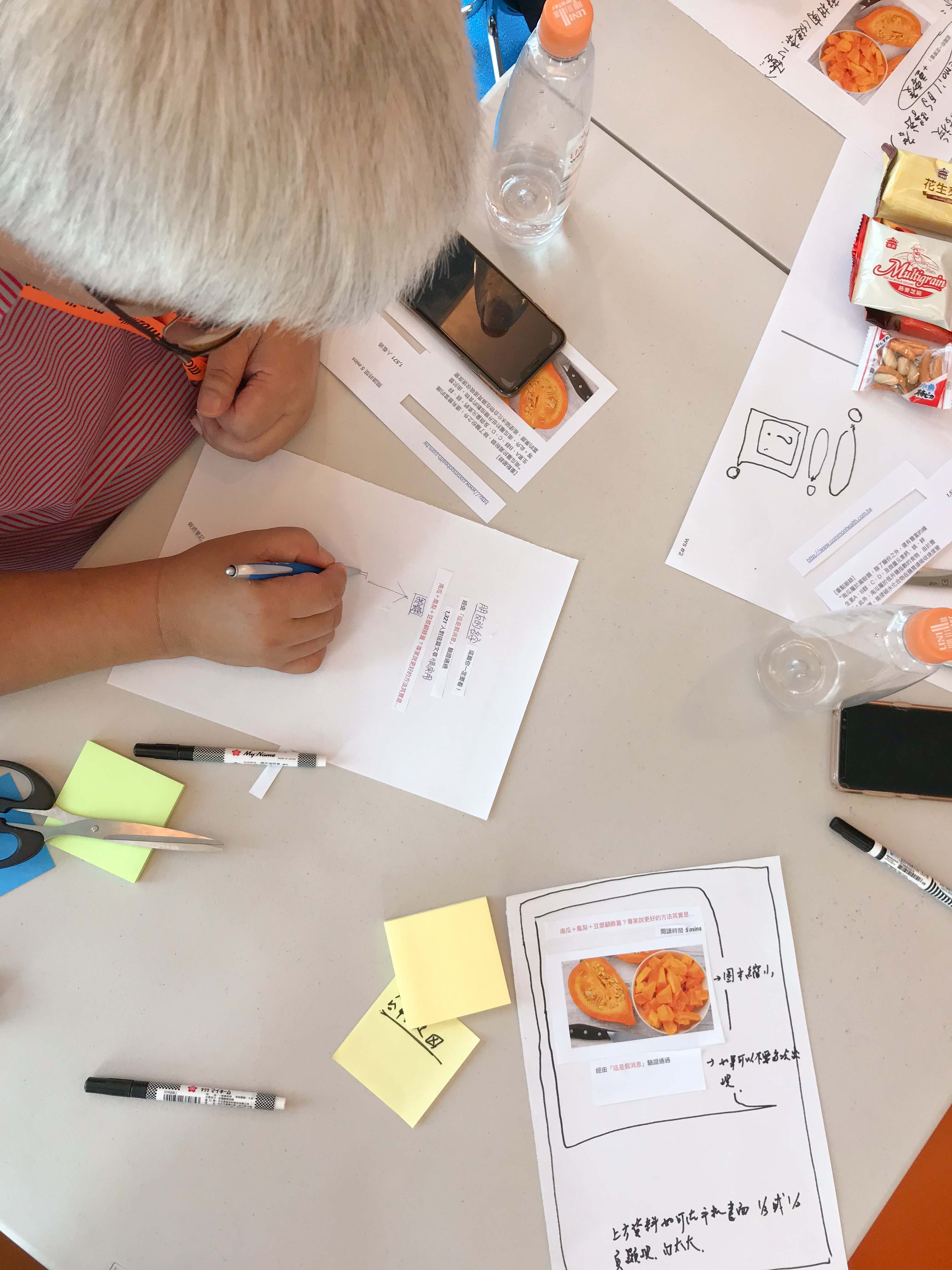
The participatory
design workshop
How do we know if the selected concepts can solve users’ pain points? As designers who are 30+ years younger than our users, we weren’t fully confident with our concepts. Therefore, we decided to host a participatory workshop to validate the assumptions and scenarios behind the storyboards, and host a mini-brainstorming session to have a interactive way to understand more about the core user problems that seniors can’t explain in user interviews.


UX/ UI design
Setting design goals can keep the entire team aligned and streamline communication with stakeholders.
The goals are set based on the priority of seniors sharing scenarios and their feedback for the proposals that were collected from the participatory workshop.

User testing results &
design Iteration
In the user testing, we focused on understanding the satisfaction level of the product features, the usability of the UI flow and seniors’ preferences of their visual styles.
When performing user testing, we observed some positive signals for the product concept. However, we also found some usability issues in the prototype design. Therefore we made some iterations afterward.
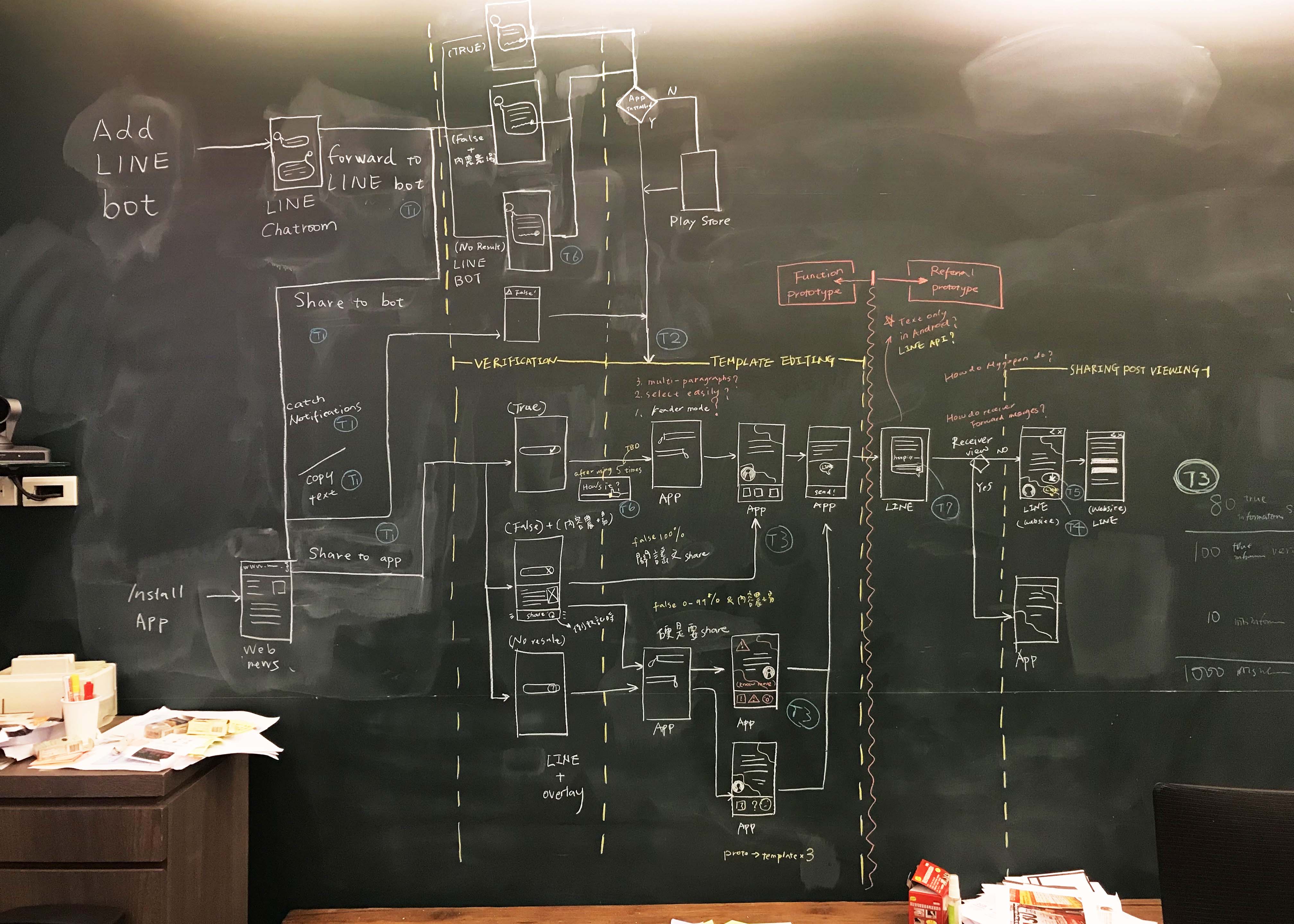
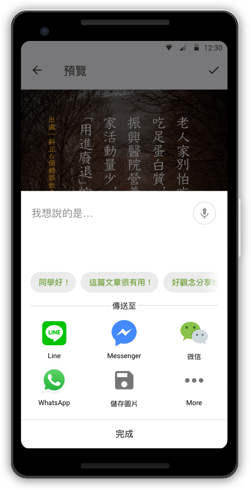
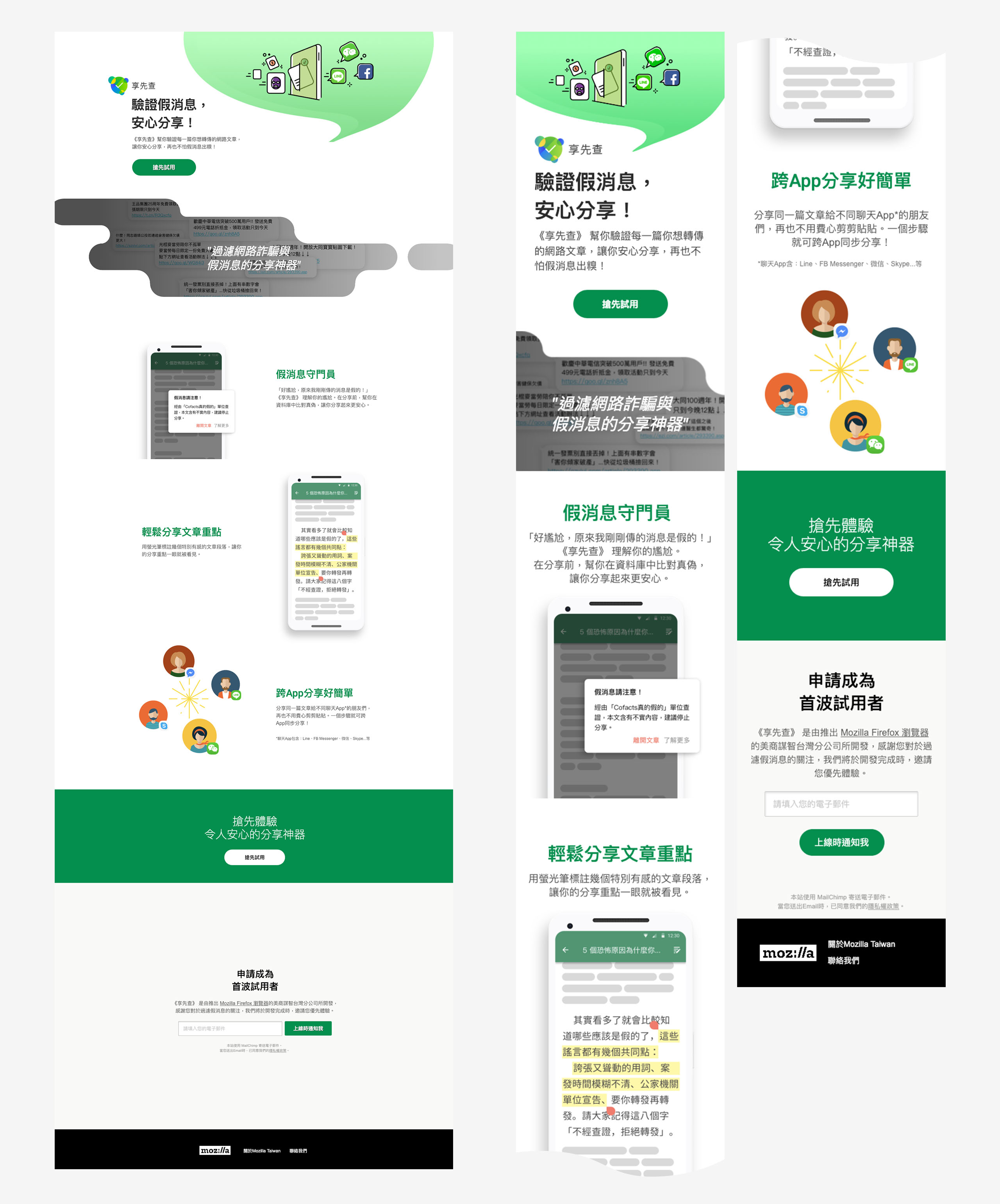
One of the article transferring methods is to use a share function from any apps that the users are using to read articles. The original UI flow before user testing was designed as below:

During the interviews, we noticed that there were some frictions for users to jump out of the apps that they used to read articles (e.g. LINE, FB, and browsers). Therefore, how to lower the barrier of transferring articles from the original app to ChecknShare became a challenge that we need to fix immediately.
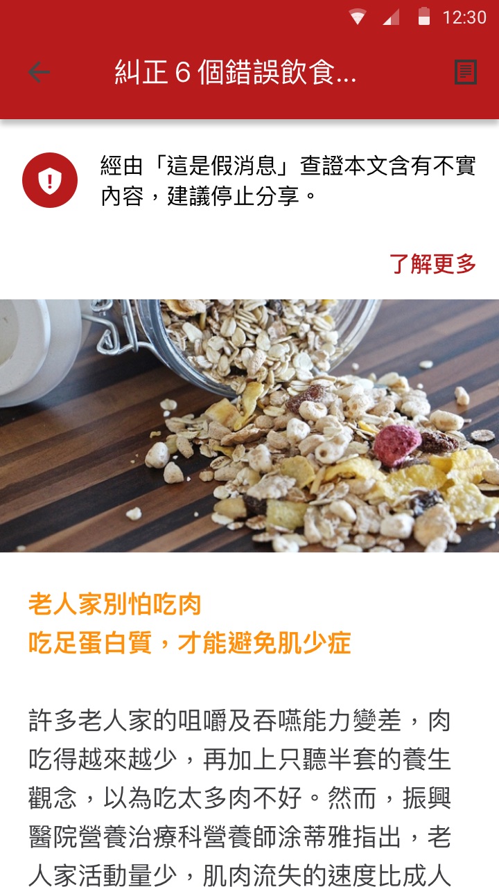
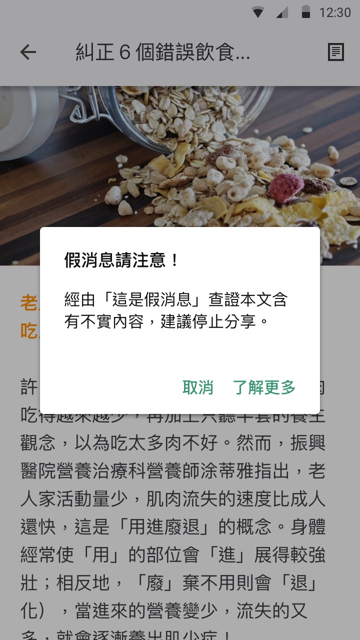
Our previous online survey result showed that sending misinformation was the top feature that people are looking for. So we decided to make the verification feature happen earlier before users actually visited ChecknShare.

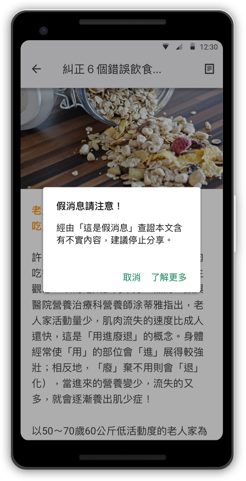
When we A/B tested different forms of the alert prompts with participants, we found that seniors generally had higher acceptance for intrusive dialogs than general users.

We tested 12 templates with different variation of styles to understand the seniors’ preference. There were some criteria that participants cared about:
Readability
It’s the most important criteria. The key of the readability are text contrast, text size, and backgrounds with less visual noise.
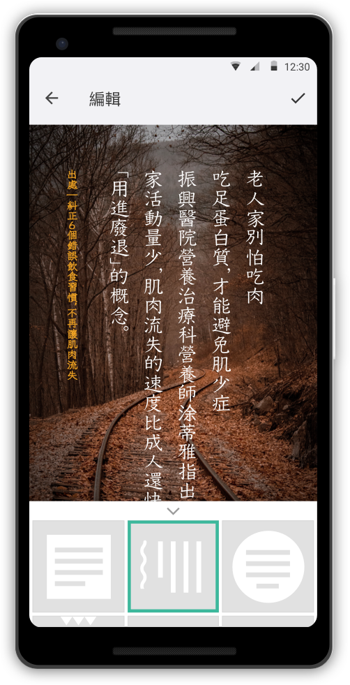
Vertical text layout
Seniors prefer vertical text layout because it was familiar to their book/ news paper reading experience.
Vivid Color
Vibrant template styles were appreciated.

Landing page test,
Diary study
The engineering resources were limited at the moment we ran the project. As I mentioned in my medium blog, unlocking engineering resources for a new project was harder than usual.
As project lead, I tried to push the project by pitching to the board and collecting evidence to answer the questions they raised:
Lessons learned
Although both the landing page test and diary study results were very positive and insightful, the project was eventually suspended because LINE announced a similar approach in their press release when we were about to wrap up our diary study findings.
The valuable lesson learned from project Checknshare was the urge of redefining Mozilla Taipei's innovation process. Our leadership team started to agree on having engineers build prototypes with code early along the way of UX team’s idea validation process.
The experience and lesson I gained from doing this project was leading a design team, finding design targets, running a design sprint, making UX design and being creative in several rounds of validations for answering stakeholders’ questions.
In retrospect, I’m so grateful to have such a wonderful learning experience, and the opportunities of actually talking with senior users, truly walking in their shoes, which made it easy for me to create designs for them. Although ChecknShare didn’t get.a chance to become a real product in the market, the experiences I’ve shared on Medium have gotten the attention of over 13k viewers, which may be insightful for them to build a new product.