
Jan, 2018
Photon Design System
UX
Website Design

Mozilla Firefox is an open source browser launched in 2004. Since it’s developed by an open collaboration model, functions are developed by distributed employees and contributors. UIs can easily be disorganized if there’s no designers constantly involved in the developing process.
In 2017, Firefox UX team reviewed the entire Firefox and found that the Preferences page needed more UX enhancements. Therefore, I was assigned to lead a team to work on the Firefox Preferences redesign project.
There were three challenges when designing with legacy:
Built by mixed code languages
From the initial study, I found out that the Preferences page was implemented by mixing new and old code languages like HTML and XUL (XML User Interface Language). To avoid tapping into the ancient code at the beginning, we decided to first reorganize the options and make it straightforward for general users to find and understand.
Inconsistent interactions and UI elements
Since there were no UX designers involved in the developing process for years, the UI ha lots of inconsistencies. Reducing the inconsistencies and standardizing the UX patterns in the Photon Design System was one of the following design goals.

Hard for old users to adapt big UI changes
Not every user likes changes, especially for old Firefox users. Therefore, we were very mindful about every single change. Rounds of user researches were performed to make sure that the UI changes really improved the UX when compared to the original version.
At the beginning, there were no dedicated PMs and developers working on this project. To push the progress further, I spent some time finding engineering resources before kicking off the development process.
The key was to pitch to stakeholders and engineers that Preferences was worth investing engineering resources on, and to visualize how well the redesign proposal improved the UX.
Since Firefox is a product that has been around for years, it requires a long learning process for understanding the history, constraints, stakeholders and how every option works before getting started.
Collaboration across different time zones
There are experienced designers from different offices who have been working on projects that are connected to Firefox Preferences. In order to collect information to get started, I hosted a weekly meeting with those designers and created a slack channel that kept decisions posted publicly so that the design progress could be transparent.
A last-minute surprise
In the later stage of the implementation, there were some fresh-eyed feedback that popped out from the content team. Although it wasn’t expected while the product launch was around the corner, we quickly integrated the feedback into a newer version, and performed an extra user testing before launching.
The team consisted of 2 core members and 3 support members
participating in the entire process.


PROJECT LEADER
Early stage product management work like defining the product roadmap, doing cross-team communications, pitching the research findings & design proposals, and finding engineering resources.
USER RESEARCH
Conduct user researches, analyze the testing results, and deliver consolidated research reports.
UX DESIGN
Make interactive prototypes and deliver UX specs.
PUBLIC RELATIONS
Write a blog to share the research findings publicly.

Redesign the
Information Architecture
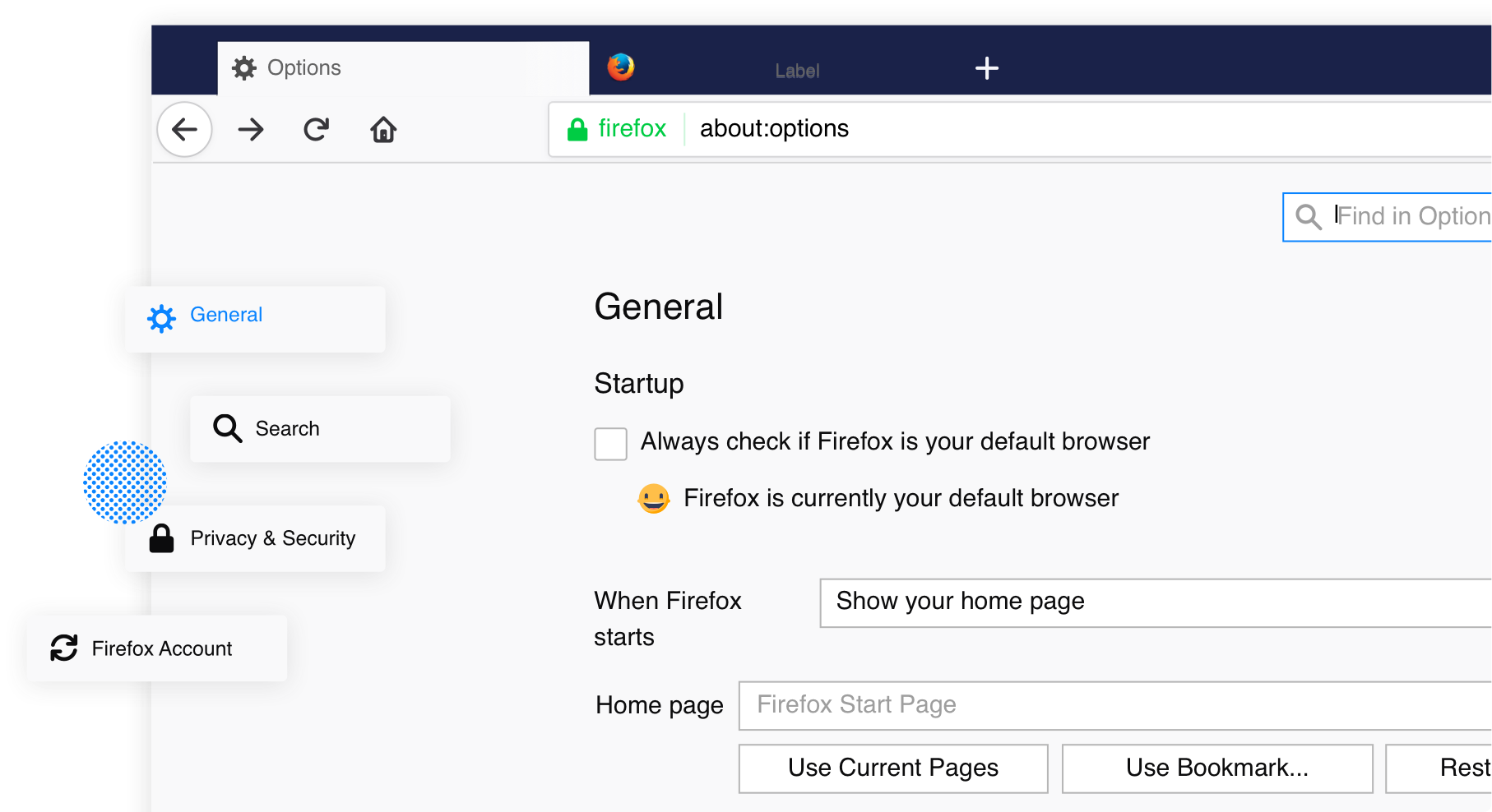
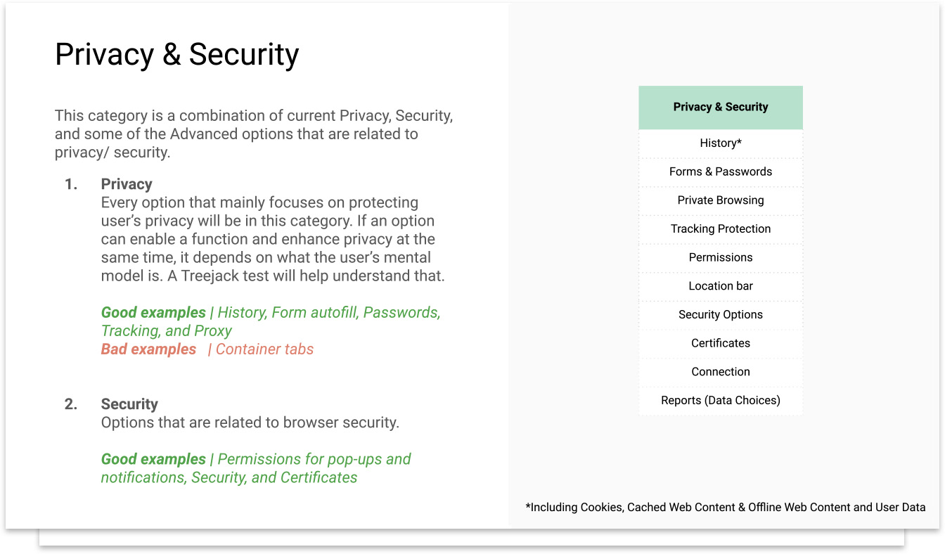
When we first looked into the original Preferences, it had 8 categories which included some indirect terms like “General” and “Advanced”, and the most misunderstand-able category “Content” which allowed users to set how Firefox handled notifications and pop-ups.
The original IA was definitely needed to be improved, and we believed that user research can help on making good decisions.
Treejack & Card Sorting are the two methods in this design phase for making sure the proposed IA and the category copy was easy for general users to understand.
Treejack
Treejack is a questionnaire-based method to evaluate the ability to find items in a hierarchy. It helps us to discover if users can locate functions in the right categories.
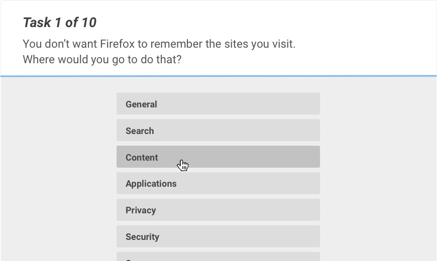
6 treejack tests were sent and each test had around 200 valid replies.
Card sorting
Card sorting is a method that allows users to group and put items in an order that makes sense to them. It also helps us to see which category names are used, and not used.
There were 38 valid replies from 45 card sorting results.
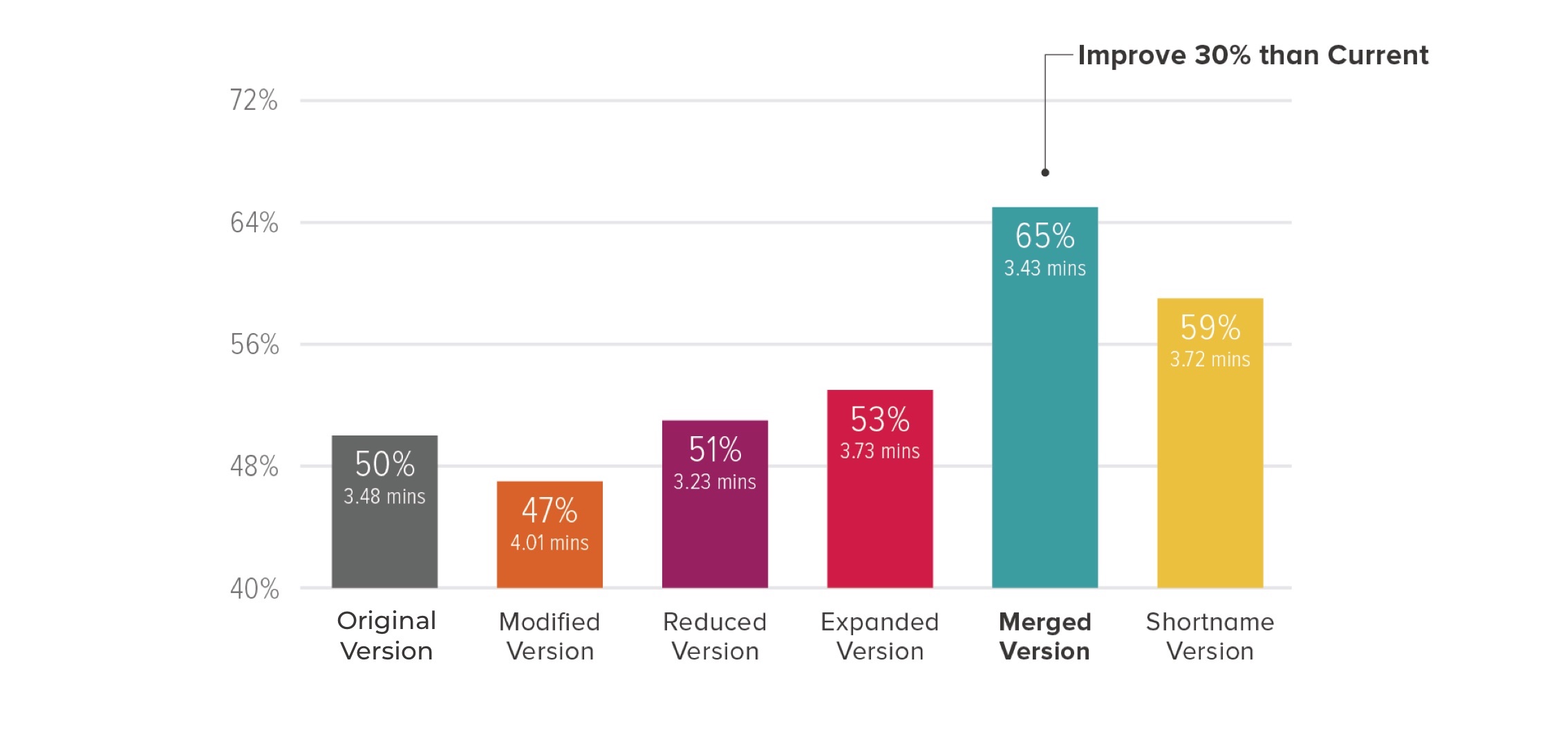
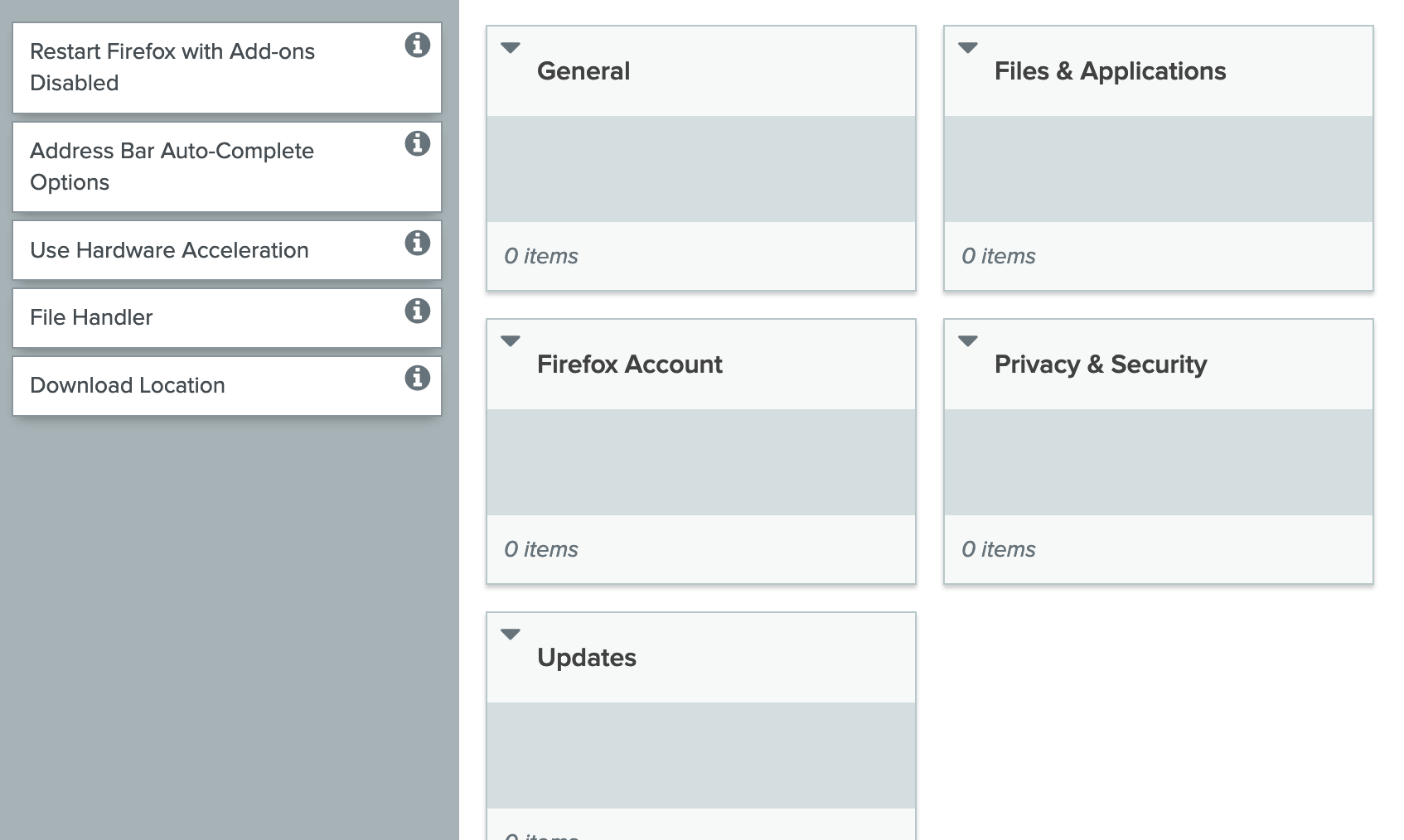
The Original Version v.s. The Merged Version
UI,UX Enhancements &
Validation
The inconsistent UI elements and interactions can easily confuse users. On the product development side, it also slows down the development efficiency for new features.
By starting from a visual audit, we made an inventory for all inconsistencies and attached a UX/ UI suggestion for each item which was documented in the Photon Design System.


Moving the options of “manage your Do Not Track settings” out of the pop-up window since:


There are some options separated in different sections but are actually adjusting the same UI element in Firefox. Setting search engines is one of the examples. I proposed some wireframes that regroups or merges the related options to make them shorter and more user-friendly.


Merging the default search engines and one-click search engine settings into the same table and move the “remove button” and “make default” to the hover state so that it can easily map the settings to the selected search engine.
The user test focused on comparing the UX redesign proposal with the original version to validate if the usability was enhanced successfully.
The prototype was tested on the remote testing tool “Usertesting.com” with 10 participants.
The merged section and the label "Search Engines" works for participants, and most of them liked the new IA (especially the idea of integrating Privacy and Security since it’s hard to tell the difference).
Some of the participants spent a long time looking for the advanced options since they didn’t notice the “Show more” at first. Therefore, we didn’t apply the idea of folding advanced options.

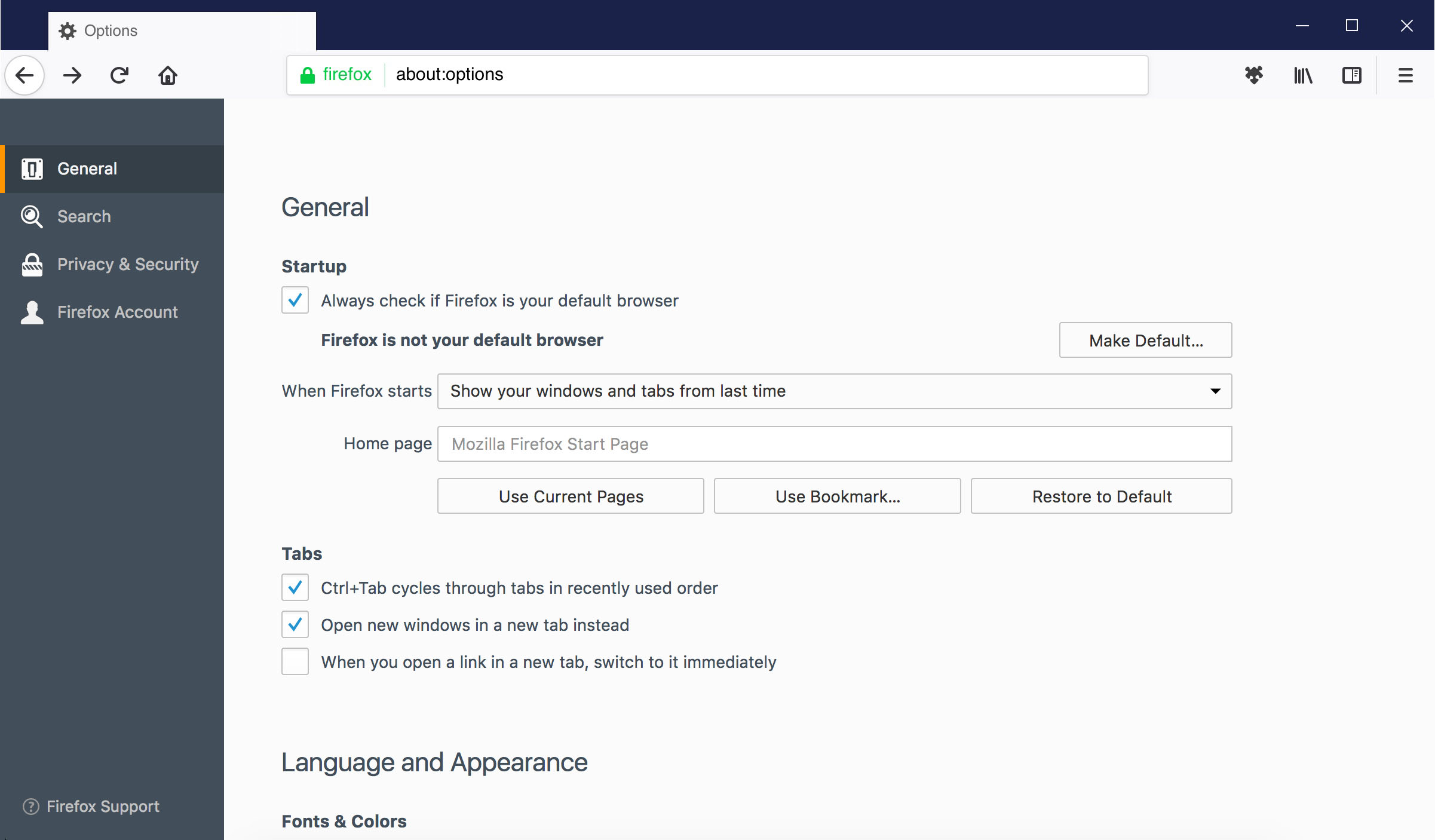
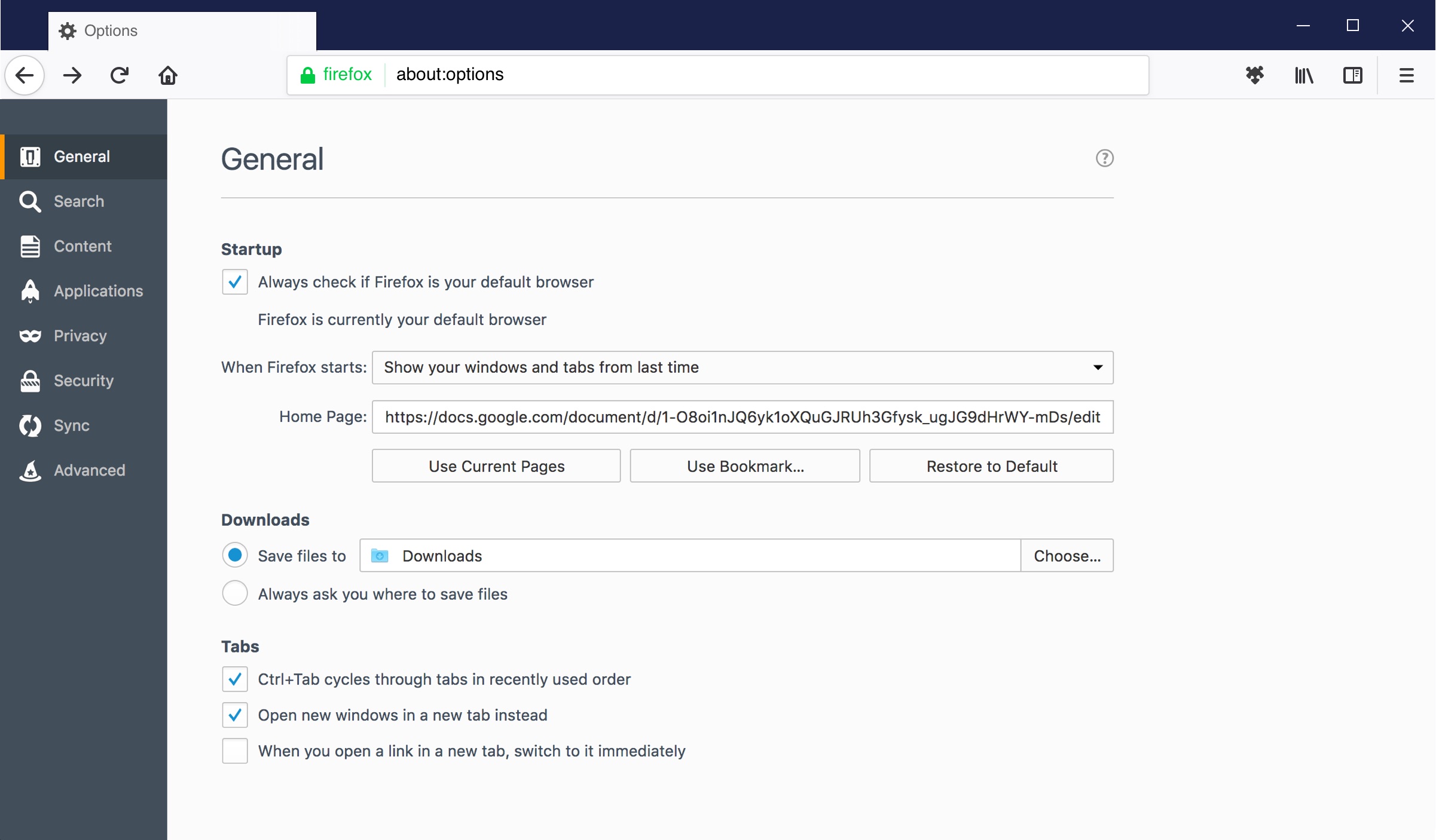
The Original Visual Style v.s. The Photon Visual Style
*The UI was designed by our visual designer
Post Redesign Optimization
The UX of the Preferences has been improved through a series of user research and UI/UX redesign, but that was not the end of the story.
The team planned to be more supportive for both internal & external audiences in the post redesign stage so that the UX can be more sustainable in the long run.
The options in Preferences changed constantly because new features usually come with a set of options for users to customize. For keeping it neat, I consolidated a category guideline which includes the rationale of the new IA and some good/ bad examples.
The guideline includes good and bad examples for each category.
During the Preferences redesign process, the team constantly collected some input from public channels. It’s another practical way to get inspiration.
We designed a search bar sticking on top of the page, and some highlights to indicate the matched keywords.

An example of the form autofill settings.
A highlight will appear in the background that indicates the option(s).
Outcome & Learning
The redesign was eventually implemented in Firefox and shipped with Firefox Quantum, which was the biggest user interface update since version 1.0.
The new Preferences received positive reviews from the blog that I shared about the research and design process. It went viral on social media, and has been viewed by 12K+ readers which still constantly has new visitors presently.
The project was almost suspended because it was stuck at allocating engineering resources. The visual designer and I made some posters that briefly told the story about the project's goals, research results and the design proposal, and brought them to the open house session at Mozilla’s all-hands meeting.
By constantly reaching out to engineers and sharing our design stories in person, we ended up finding an engineer in the organization who had experience working on Preferences and keen to work on the first phase of the redesign proposal. That very first phase kept the ball rolling in the implementation progress.
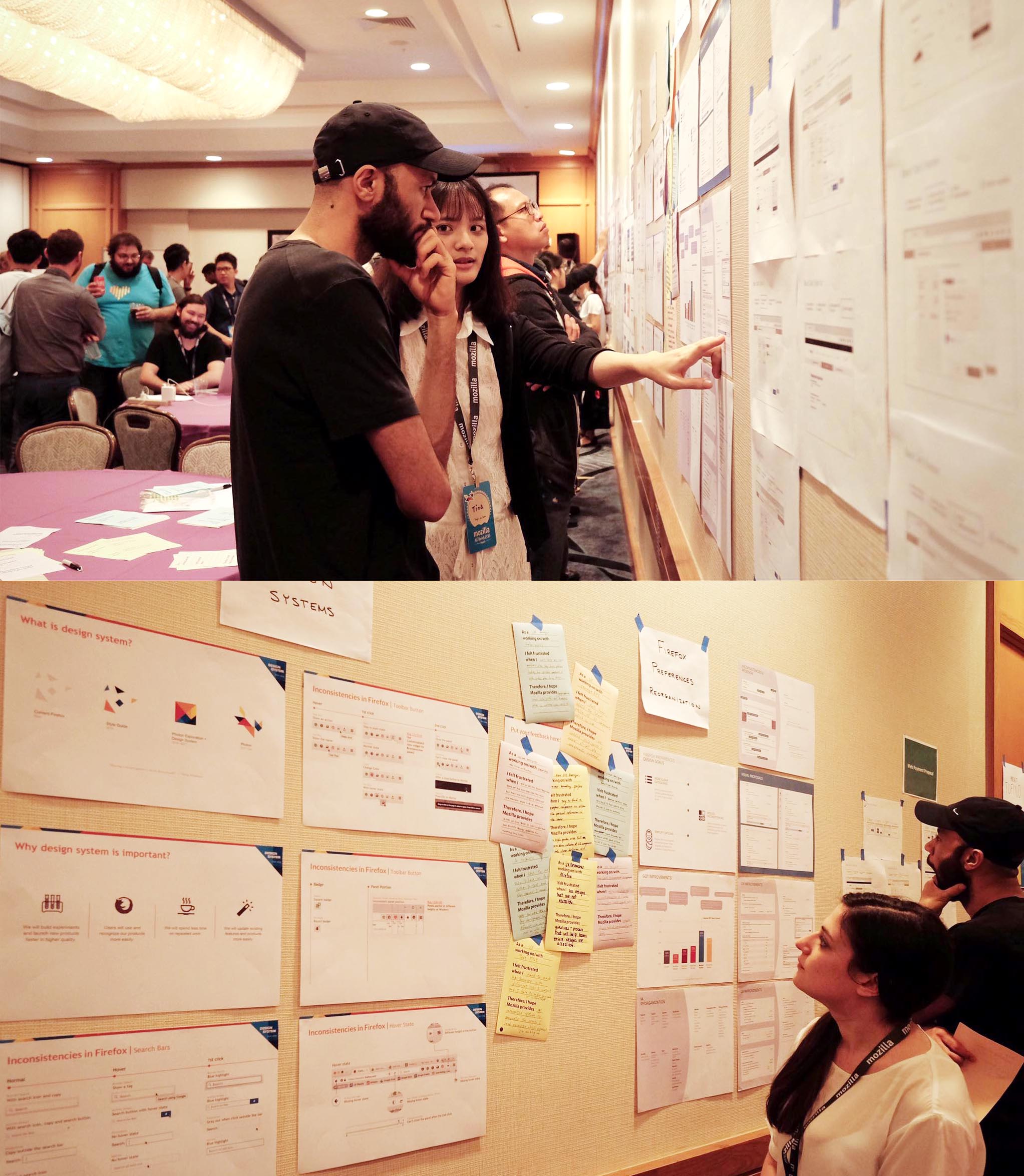
Sharing our design story with posters on wall during Mozilla's all hands meeting.