juL, 2020
Firefox Lite
UX
Research
Product Management

Photon, the code name of the new UI style in Firefox, was shipped in 2017 with the major update “Firefox Quantum”. Before officially releasing the Photon UI in Firefox, the UX design team started to build a Photon Design System to replace the old style guide which was built for the old UI style “Australis”.

The design system team consisted of designers from North America, Europe, and Taiwan. Some designers had front-end experience, while other designers were purely visual designers. That variety of professional backgrounds added some levels of difficulties when we examined a single piece of the design system (such as a visual design language) with different perspectives.
However, experiencing the design culture shock of working with international colleagues was good for me. I learnt how to leverage the Sprint mindset to take baby steps to move forward, and how important it was to spend time on thinking about “why” before diving deeply into solutions.
Firefox has a wide product portfolio on all platforms: Windows, MacOS, Linux, Android, and iOS.
It’s challenging to design a system for multiple platforms. One of the directions that the design team wanted to go was to make Firefox look native on all the operating systems in order to enhance its usability. Therefore, nicely balancing Firefox’s unique style and the OS’s style became a big challenge for the Photon Design System. The team discussed with the product designers from both desktop and mobile teams to come up with a consensually clear line of when and how, to use the Firefox’s design language or the OS conventions.
The design system team was an independent team in the organization documenting the design guidelines and building the infrastructure of design tools and design tokens. Since the key stakeholders such as the design director and engineering leaders weren’t part of the team, frequent communications with them became essential to making progress on building the design system.
The purpose of frequent communications with stakeholders were:
1. Getting up-to-date information on Photon UI
2. Confirming the design guidelines that we consolidated from the Photon UIs were aligned with the stakeholder’s expectations.
The team purely consisted of designers.


DESIGN GUIDE EDITOR
Conducted a visual audit, documented visual design language and defined the usage of the components.
WEBSITE DESIGN
Designed the IA of the Photon Design System website and published the content by HTML/ CSS.
DESIGN SYSTEM ADVOCACY
Constantly communicated with designers, front-end engineers, content strategists, and brought more visibility to the vision of the system.
The problems,
goals, philosophies,
and workflow
There were several style guides that were tried to build guidelines for designing a product in Mozilla, but unfortunately, none of them were totally adopted in the organization.
“What were the challenges?”
The very first thing that the team did for the project was to interview people who worked on the previous style guides to learn their difficulties.
New features are constantly added to Firefox. To make it the most flexible for the future, all elements of the visual design language are built with the consideration toward future scalability on both desktop and mobile.
(For example: Typography)
For how to choose between the Photon Design System and the platform conventions, there is a page that exposed and demonstrated the principle and why the system offers this recommendation.
High Visibility: Align with Photon Design System
Lower Visibility: Can use Platform Components
Accessibility is critical for an exceptional user experience. All visual design language and UI components had to successfully pass the WCAG 2.0’s color contrast test before they were documented on the Photon Design System. Therefore, it can save the designers’ time from checking if the visual design meets the accessibility requirements.
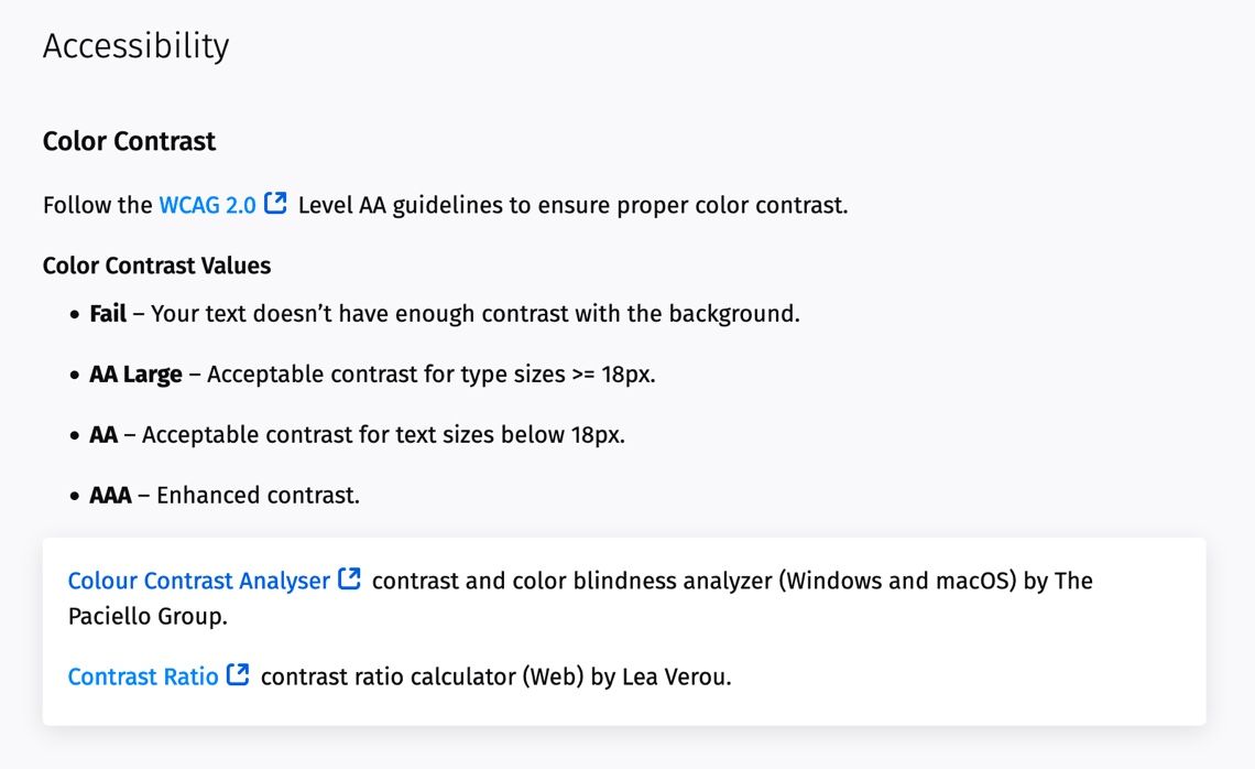
The color contrast analyzer tools with guidelines that we used for Photon Design System
“How might we create a momentum in the organization?”
After learning from the past, we found that advocating the concept of the design system was essential to the success. There were 3 main tactics we used in the project:
Initiate Deep Communications
The team spent more time focused on “why we needed a design system” than “what we should deliver” for building a design system. We worked with designers, engineers, and even content strategists in the globally collaborated team to get onboard on building a design system and the willingness to adapt it into their day-to-day design/ engineering process.
Internal workshops and meetings were hosted to make people aware of the Photon Design System, and align the expectations from different functional teams.
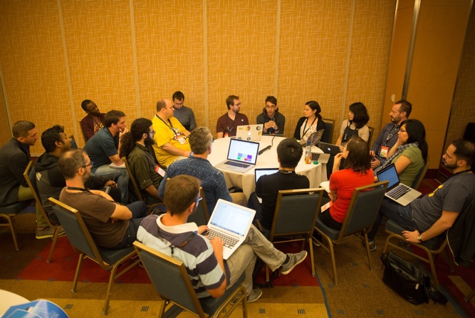
A meeting in Mozilla’s June 2017 All Hands for collecting feedback and expectations from different product teams.
Co-design the Design System
1. The system was built on Github
The way we built the Photon Design System was to fully adapt the spirit of open-source. The progress was transparent to everyone. People could use the system, and at the same time, were encouraged to contribute to it (including making changes and opening issues).
2. The collaborative process
While we were documenting, we ended up actively co-designing with stakeholders what eventually became a real design language that supported multiple projects and platforms.
Build Design Tools
We believe lowering the barrier of using the Photon Design System can help everyone who works on Firefox naturally adopt it in their everyday workflow. To accomplish that, the team focused not only on the content of the guidelines, but also on providing design tools and resources for both designers and engineers.
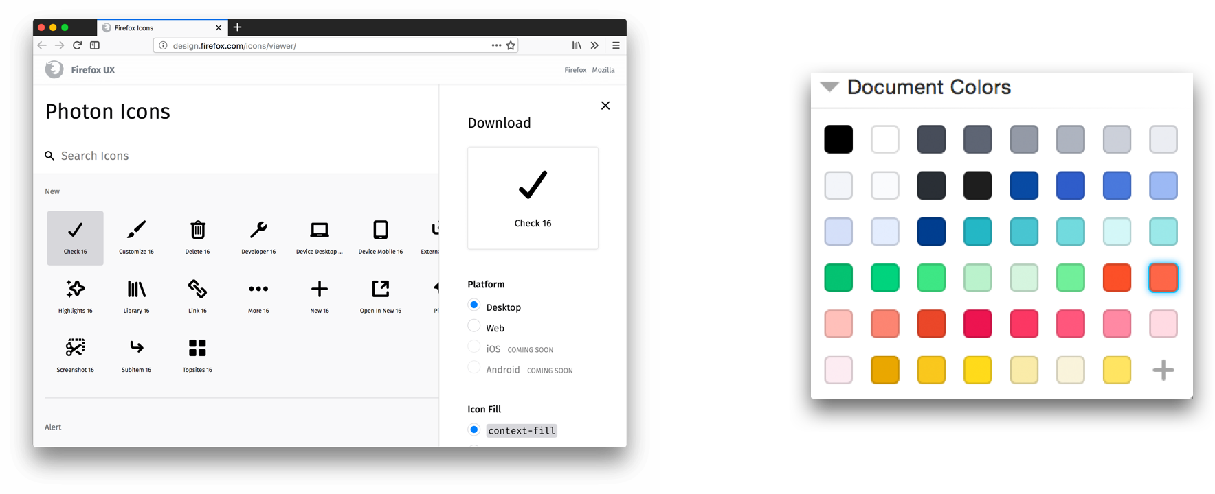
Examples of the icon library and Sketch color palette which were built by my colleagues.


About defining the
typography guideline
As the Photon UIs are being designed simultaneously by designers distributed from multiple countries, it results in a number of UI inconsistencies and accessibility problems.
The need of having a typography guideline was urgent to solve these problems. Making a type scale family which is adaptable to all platforms and scalable for future use were the main focus when I was developing the typography guideline.

The Firefox family that the type scales are designed for.
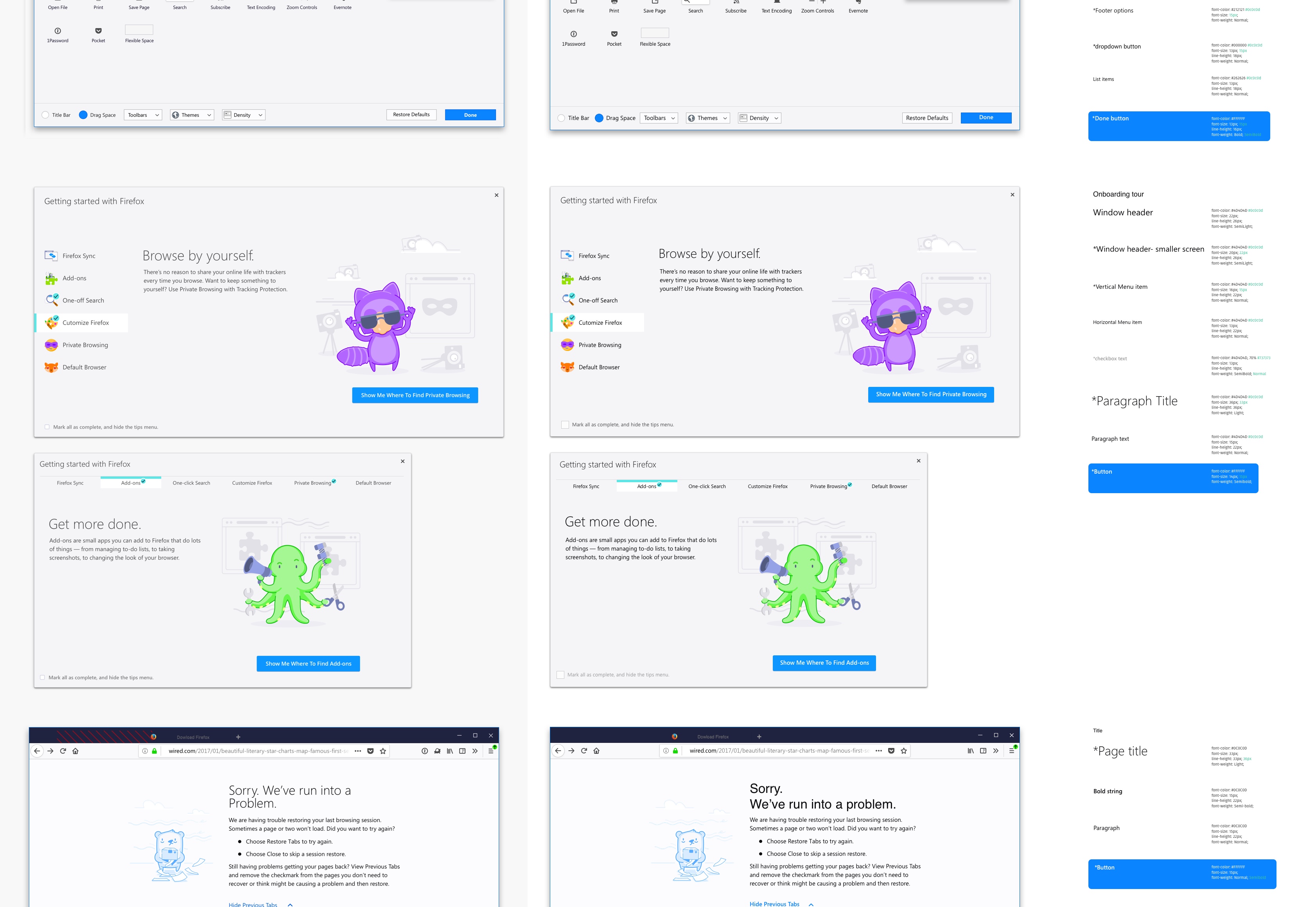
For the Firefox desktop, I collected the UI inventory and discussed with designers to find common ground to achieve the UI consistency and accessibility goals.
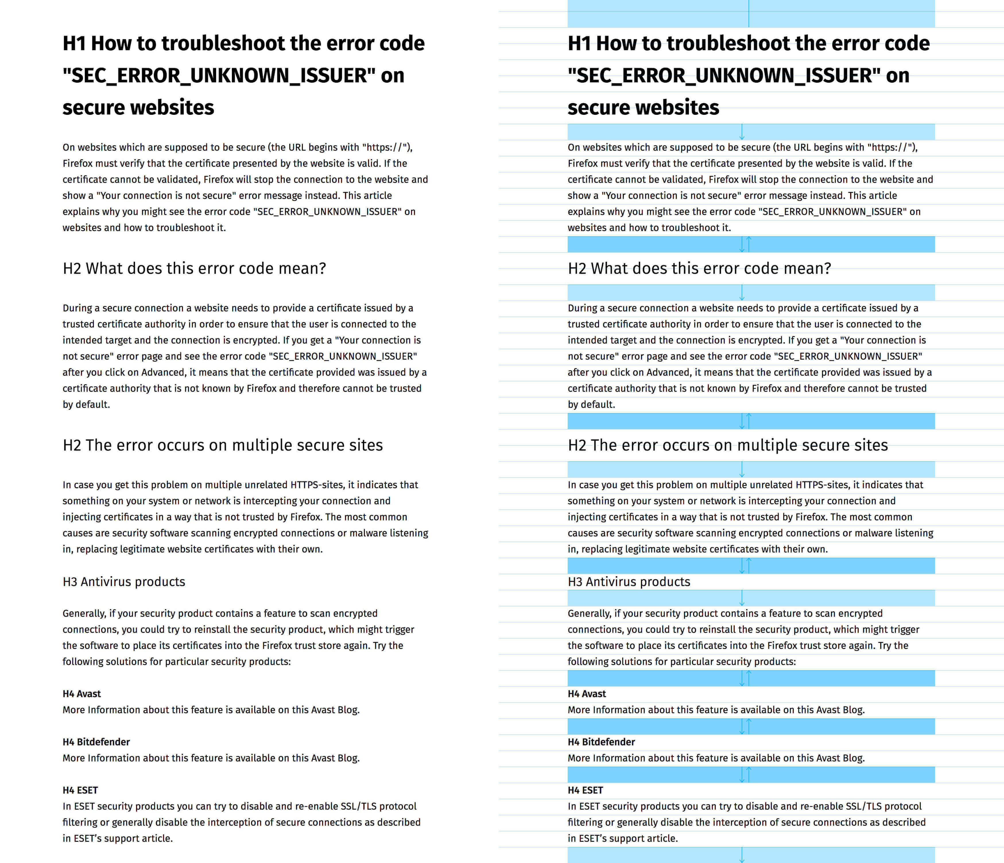
The type scale was also tested with the real content on content-heavy websites like Mozilla Support to make sure it provided a good visual hierarchy.
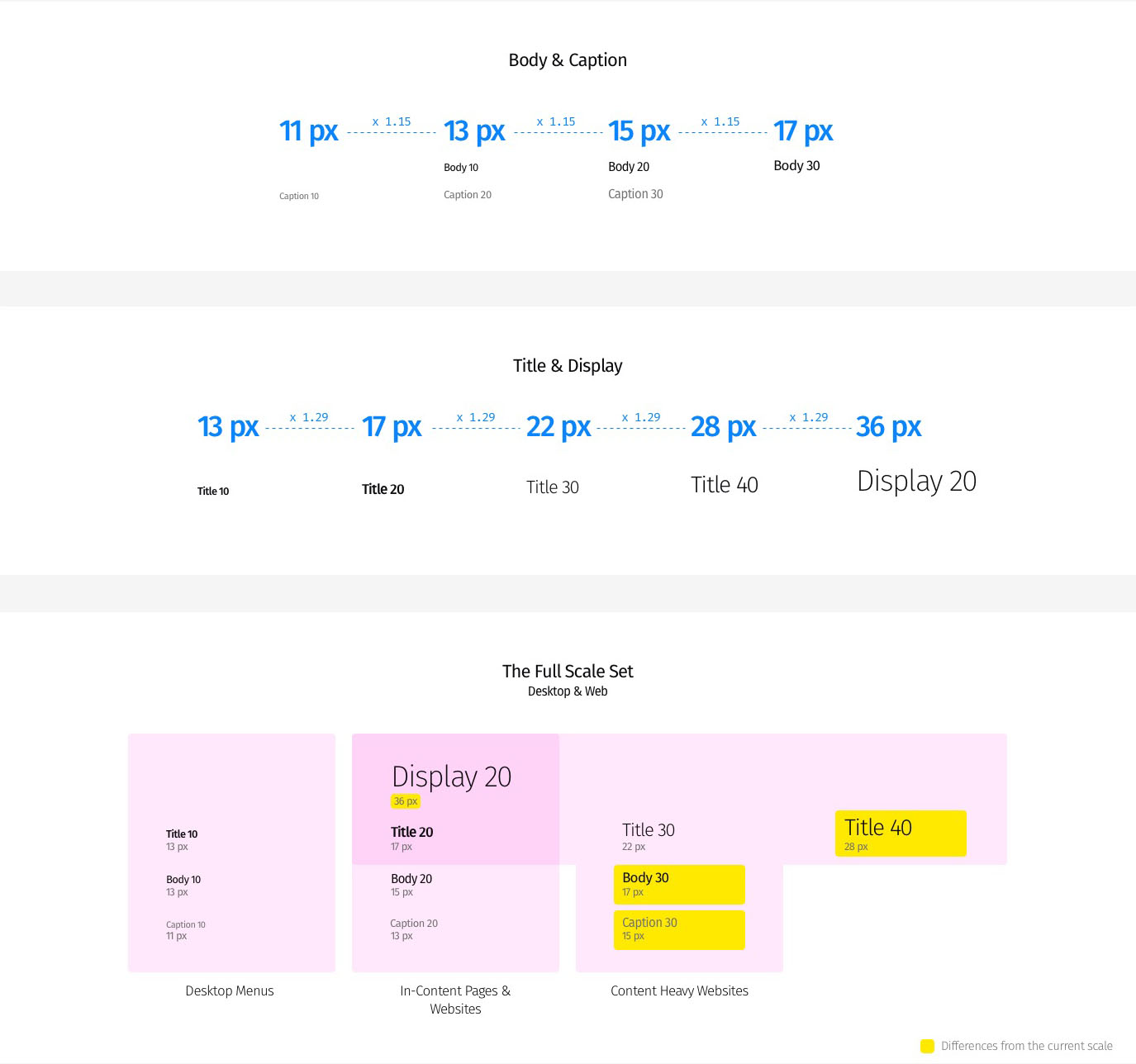
After rounds of experiments, 2 type ratios were defined in developing the responsive type scales and was documented on the Photon Design System website.


Followed up with UI examples to elaborate the differences between Display, Title, Body and Caption, and how to use the recommended type pairs.


Recommended text colors in light and dark backgrounds by considering WCAG 2.0 color contrast guideline.
Outcome & Skill Learned
A design system is a living system, so it’ll never end. Before I was asked to shift around to other projects, Typography was a fully documented visual language on the Photon Design System Website. Other UI components such as link, input field, card, and overlay’s guidelines were published.
The guidelines help designers and engineers efficiently create new UIs that align with Firefox Photon’s visual language and provide the best UX for the user.
To bridge the gap between designers and engineers, I had to learn how engineers work. Sometimes I had to force myself to jump into their tools so that I could find the best balanced solutions to meet their needs.
The skills that I learned from this project:
* Communication skills for cross-team collaborations
* Responsive typography
* Using Git to publish guideline content
At the end of this project, My contributions were recorded on Github, which had never happened in my design career.
And most importantly, the design-system philosophy encourages me to design reuseable components, select color and type scale meaningfully, and last but not least, take care of the accessibility.